In recent years my photography has gradually shifted toward black-and-white. I enjoy its inherent lack of reality and added emphasis on line, shape, and tonal contrast, qualities that interest me more than color. I find the black-and-white format offers more room for interpretation and expression. However, I have resisted the urge to abandon color altogether, preferring to let the scene dictate the format. It just so happens that fewer color scenes interest me. Lately, I’ve been experiencing a growing sense of dissatisfaction with my color photographs. I now often find color to be too literal, especially in scenes that are beyond the intimate scale.
I strive to make photos that are both creative and expressive, photos that reflect my vision and way of seeing the world. My images are not an objective representation of what I see, but rather a subjective interpretation. However, some images can be characterized as subjective representations. That is to say, images in which the subject matter may still be representational in terms of an accurate rendering of color and lighting, but the choice of subject matter and more importantly the composition is subjective. By definition then, all images that are a subjective representation are color images. But, are they still creative and expressive? In my mind, I know the answer is yes. As a litmus test I often ask myself, would a random person have seen this? If I believe the answer is no, I consider it a creative photograph. Composition is the most powerful creative tool available to photographers. And yet, despite the subjectivity I am finding it harder to get past the representational quality in my own color photographs.
Subjectivity in a photograph is primarily a product of the imagination of the photographer. However, I find the degree of subjectivity is often a function of scale. In recent years photographing intimate scenes has become increasingly popular. Images of ice details, mud cracks, wild grasses, etc. are everywhere on social media. Whether rendered in color or black-and-white, intimate, close-up scenes allow more room for interpretation and subtlety. They are more subjective and more personal. However, as the scale of the scene increases from intimate to medium distance and further to grand landscapes the subsequent images automatically feel more objective and descriptive. In color, they feel literal. I have often wondered, is it possible to make a subjective photograph of a grand scene photographed in color with a wide-angle lens? I’m not sure.
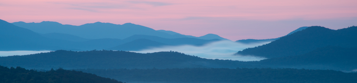
I made the image below on a recent springlike afternoon. I was drawn to the three hemlock trees set amongst the ancient lichen-covered rock. Even though I was moved by the scene and the composition is spot-on, I am finding it difficult to find satisfaction in it. It’s not so much a question of creativity, but rather a literalness that feels discomforting. It may be creative, but it doesn’t feel that way. Creativity in a photograph being a matter of degree and not an either/or proposition, it may be I find the level of creativity to be below my level of interest.
Ultimately, I believe my dissatisfaction with the photo is due to a continuing shift in my aesthetic tastes. Our vision continues to evolve (hopefully) over our lifetime as we avail ourselves of experiences and other influences. Perhaps the lack of reward I find in color photography beyond the intimate scale is reflective of that evolution. There is little color “landscape” photography out there that moves me. In addition to the literal quality of much of it, there is also a sense of having been there, done that. The work I am most drawn to is black-and-white. I look at the photography of Nicholas Bell and am floored by it. There are qualities in his work and in my black-and-white photography that I can no longer find in color. It is without question that color photographs can be creative, but there is a literal quality in much of it that no longer interests me.


That’s an interesting issue that you’ve raised Chris and perhaps it’s a stage photographers go through as they develop and their creative inspirations and style changes – you’ve put one possible reason (literalness) into words so eloquently. I’m slowly moving back to black and white photography which was my first love in the days of film, therefore, the photograph you’ve shared, which is a beautiful colour rendition, also raises the question I find I am asking myself more and more “what would that look like in black and white?” Thank you for sharing your ideas – it certainly is food for thought. Btw – Nicholas Bell’s photography is quite beautiful, thanks for the introduction to his work too!
LikeLike
Thank you for the comment, Lin. Isn’t Nicholas awesome? Just fabulous work. With regards to the photo I shared, I knew it wouldn’t work well in black & white due to the fact that there is little tonal contrast.
LikeLiked by 1 person
Excellent explanation Chris. Timely too as I have been grappling with a similar struggle, although I didn’t know exactly why.
Your explanation of why colour is problematic for you made me realize that it does make a photograph much more a representation of object reality, and may explain my gravitation towards more intimate scenes because as you say, they allow more room for interpretation and subtlety.
I felt a little pompous for wanting to move from colour since there is that age old saying that only BNW is art, but perhaps there is some truth in that, or it just means that making a meaningful colour photo is that much more difficult.
On the flip side I have a few colour photos which are dear to me, and some that I know are dear to others. I’m having a hard time “letting go” of these photographs to specialize in BNW, either because of my personal love, or because of the pressure from the masses via social media. The jury is still out on that one.
I think I may continue with colour, albeit less so. However, there will always be that nagging irritant that my portfolio won’t be consistent.
LikeLike
Thanks for commenting, Jason, I’m happy you enjoyed the article. It sounds like for you and me the shift away from color is part of our natural evolution and the search for more creative and expressive photos. I firmly believe that color photos are just as “artistic” as B&W, I simply prefer the latter. With regards to an inconsistent portfolio, remember that Harry Callahan and Wynn Bullock worked in both formats and different genres. I remember reading once the supposition that Callahan wasn’t more well known because of this. True or not, we need to follow our creative path, wherever it takes us.
LikeLike